CASE 02
SmoothRunning


ROLE
TYPE & INDUSTRY
TEAM
DURATION
Summary
SmoothRunning is an Australian window-cleaning service that outsources tasks to skilled workers. With 1,000+ job searches and 100+ clients each month, and a workforce of 50+ in Sydney, I led UX and collaborated to solve complex workflow challenges.
“

I need the current tool smoother and efficient for us to use – easier flows, automated tasks, efficient communication, and a slick look…
In my role at SmoothRunning, I transformed the design function into a business asset by optimizing workflows for internal teams. I developed intuitive interfaces and dashboards that achieved a 43% increase in overall user satisfaction and reduced decision-making time by 33%, enabling teams to respond effectively to their business challenges.
90
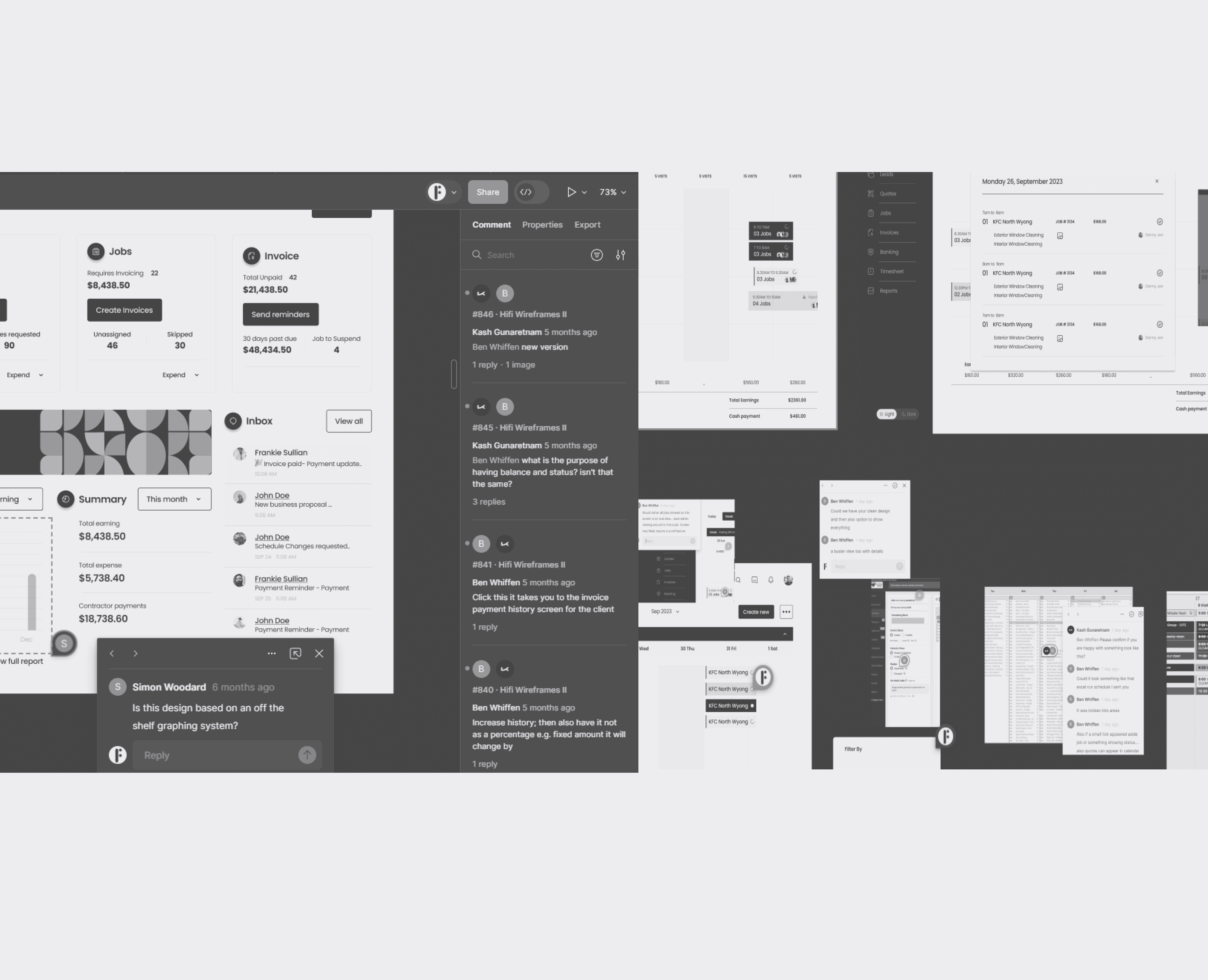
Hi-Fi Wireframes
33%
key task completion rates
43%
overall user satisfaction
BEFORE - Clients Screen
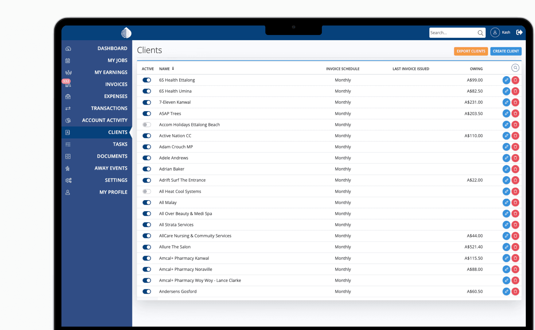
AFTER - Clients Screen

Problems
The current product’s complex task flows, diverse needs, and cluttered interface result in low operational efficiency for internal teams.
Goals
Automate daily tasks to enhance communication and operations, reduce duplicates and repetitive tasks, and integrate new features.
Challenges
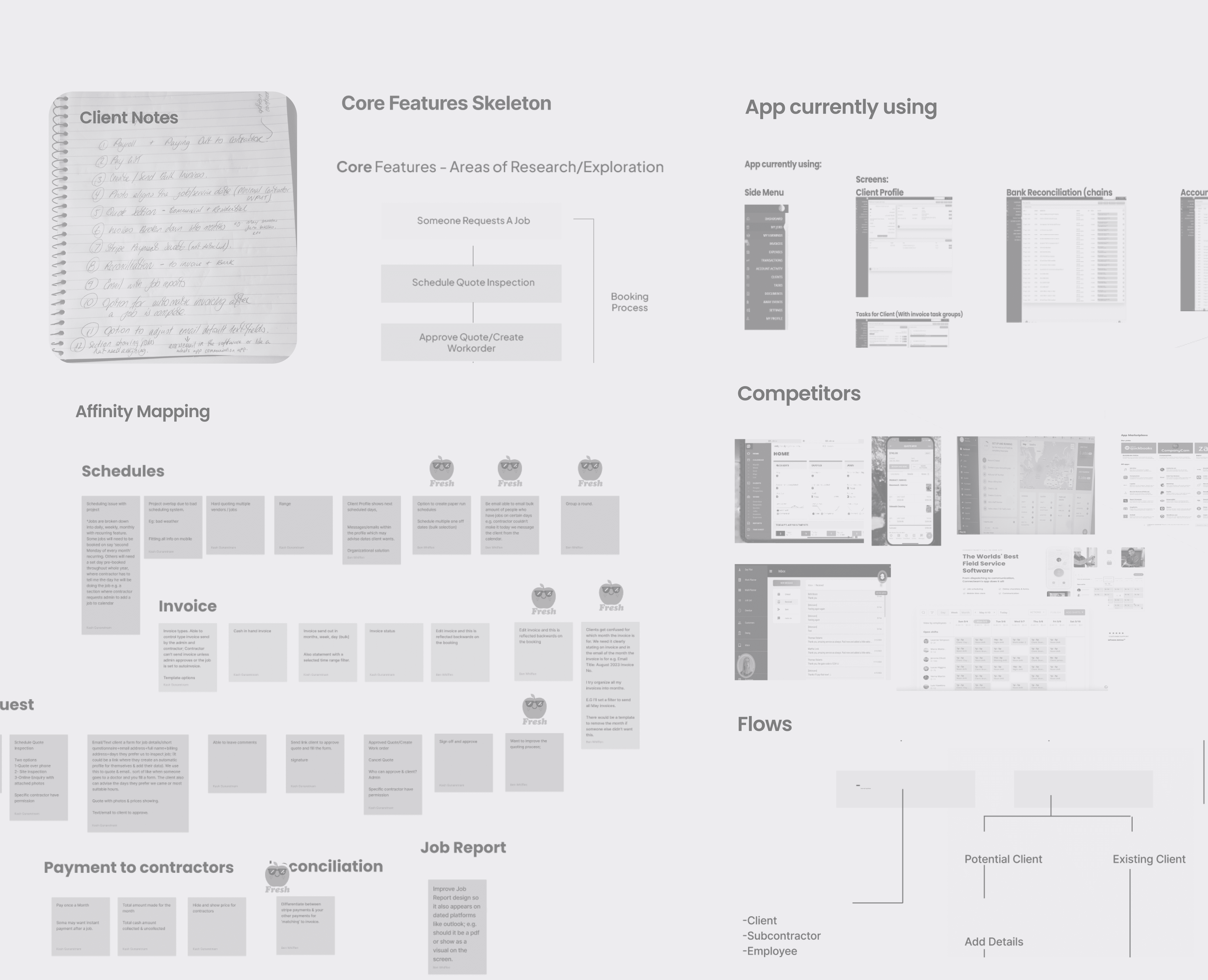
Collaborations & Design Process


Solution 01—Tailored Navi Sidebar for Tab Clutter Avoidance
Prioritized Task Flows & Team Needs
The sidebar was streamlined to 10 tabs, aligned with four core task flows identified during the ideation phase. Tab names were clarified, settings were merged with the user profile, and key functions were moved to the top navigation bar for user efficiency.

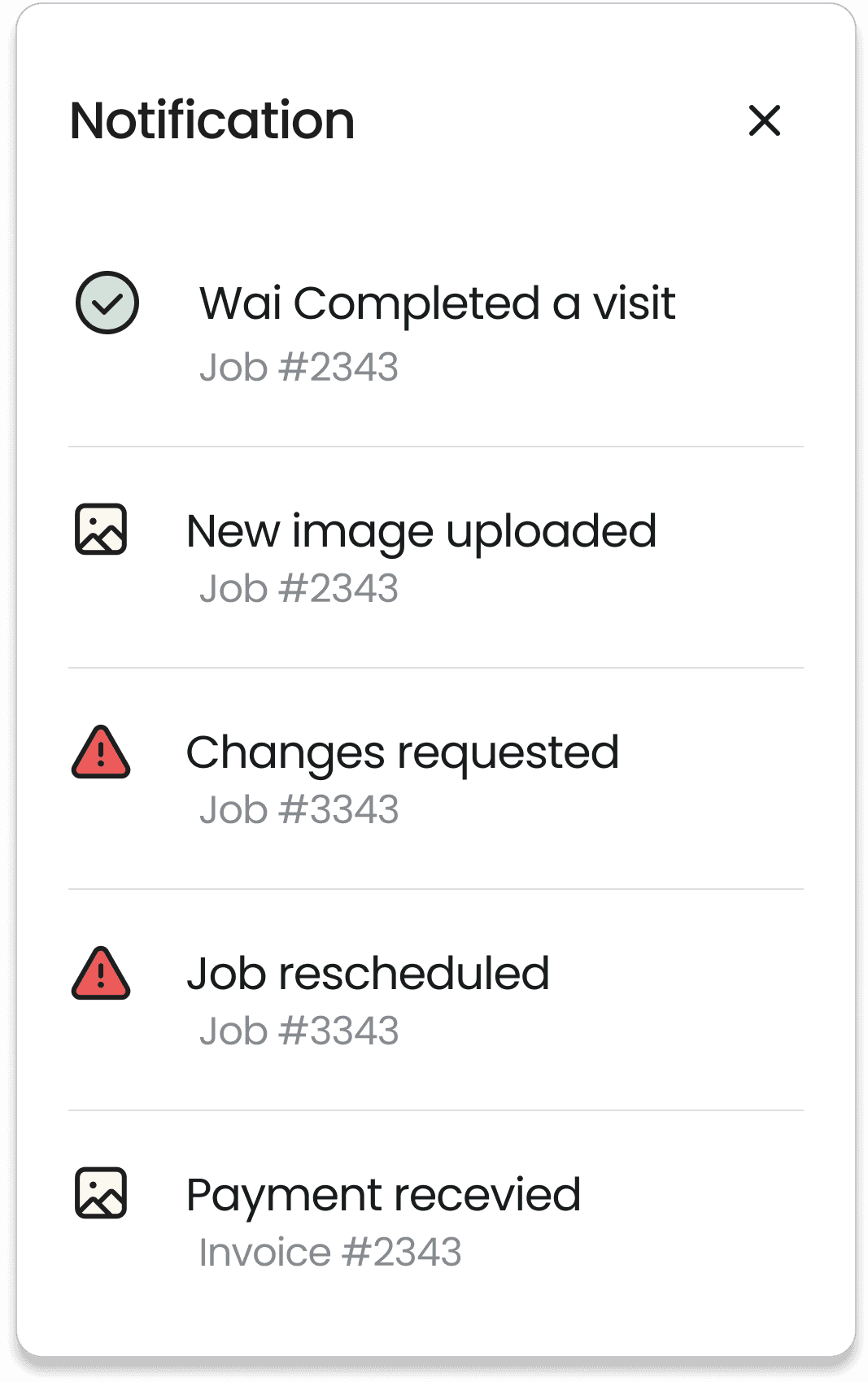
Solution 02—Home Dashboard for Quick Access
Multiple Entry Points to Tasks
The home dashboard, customized for team operators, offers easy access to tasks through tailored navigation. Upon login, users encounter personalized dashboards for quick access to needed info. Dark mode is included to enhance readability in low-light conditions and reduce eye strain.
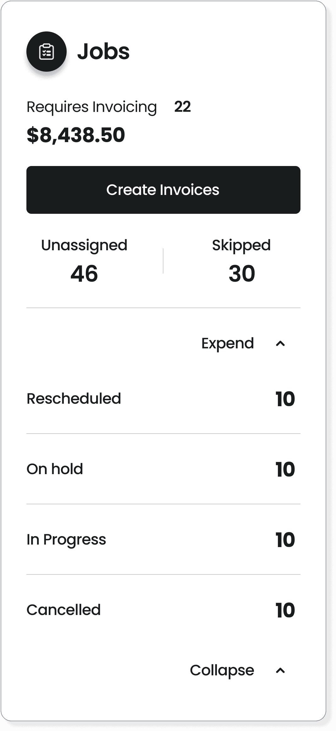
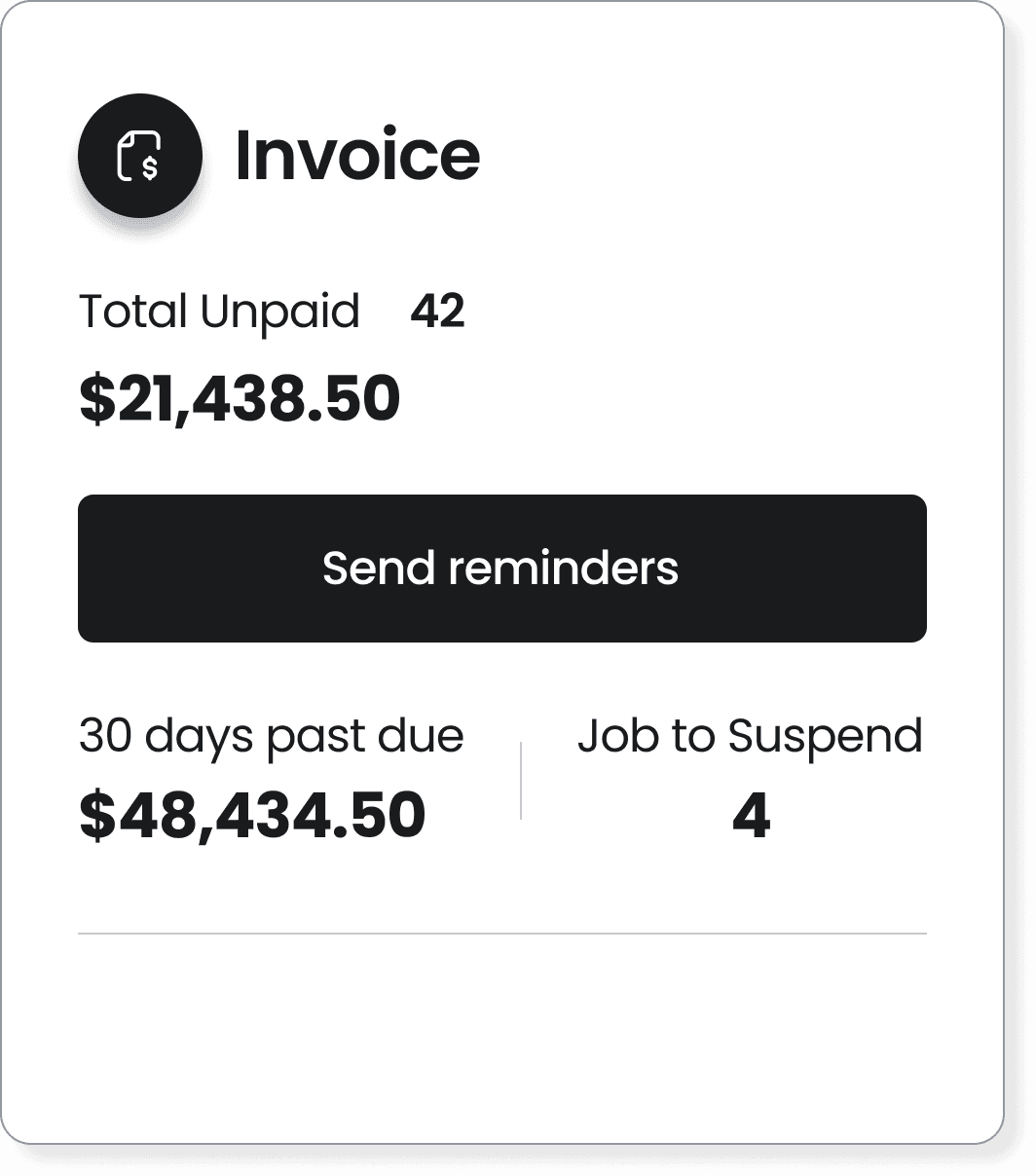
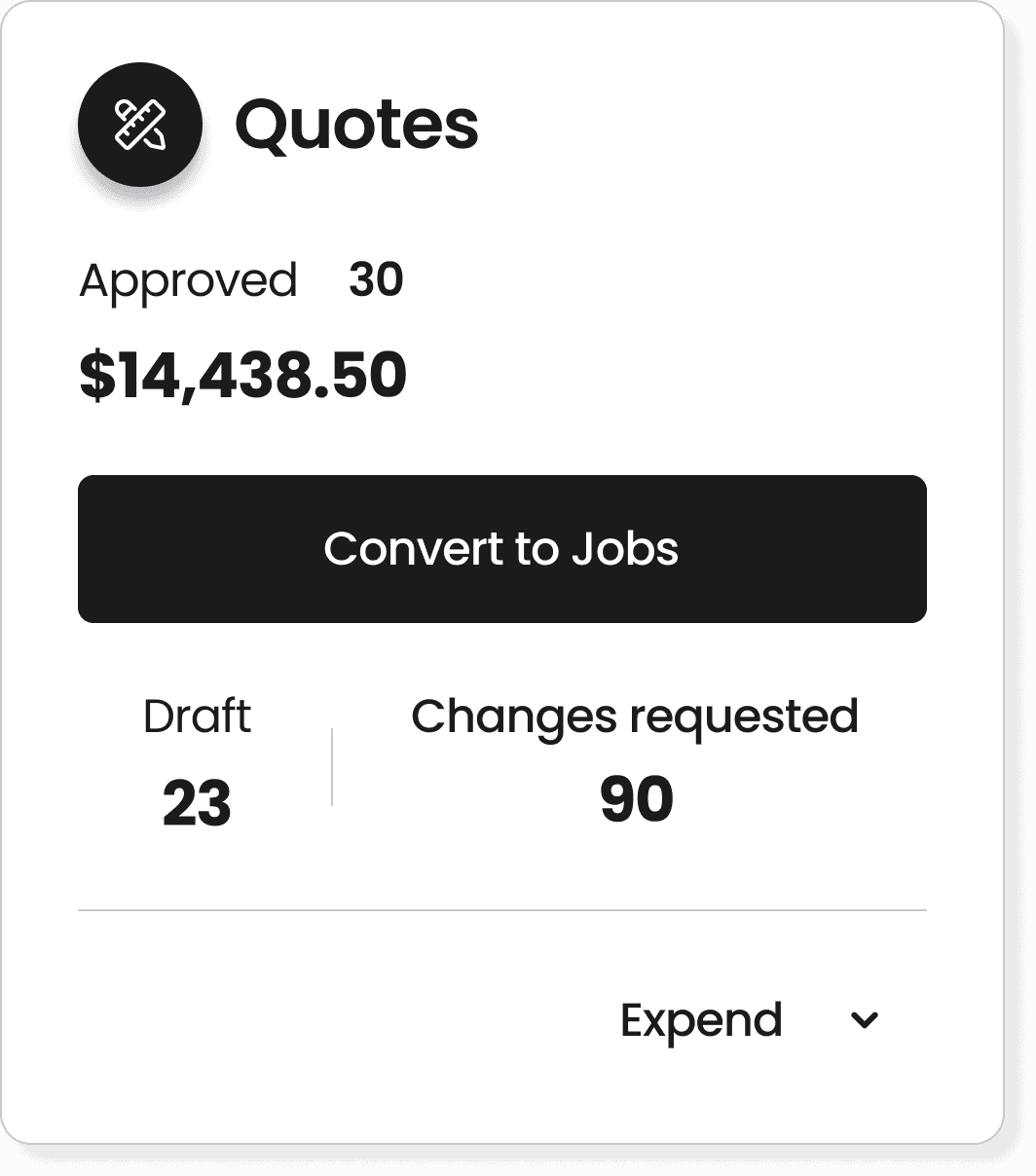
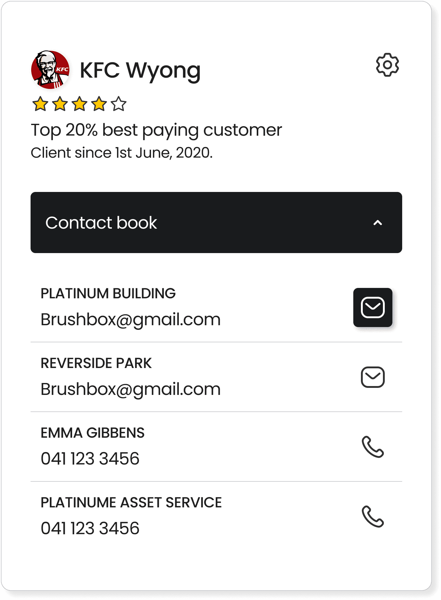
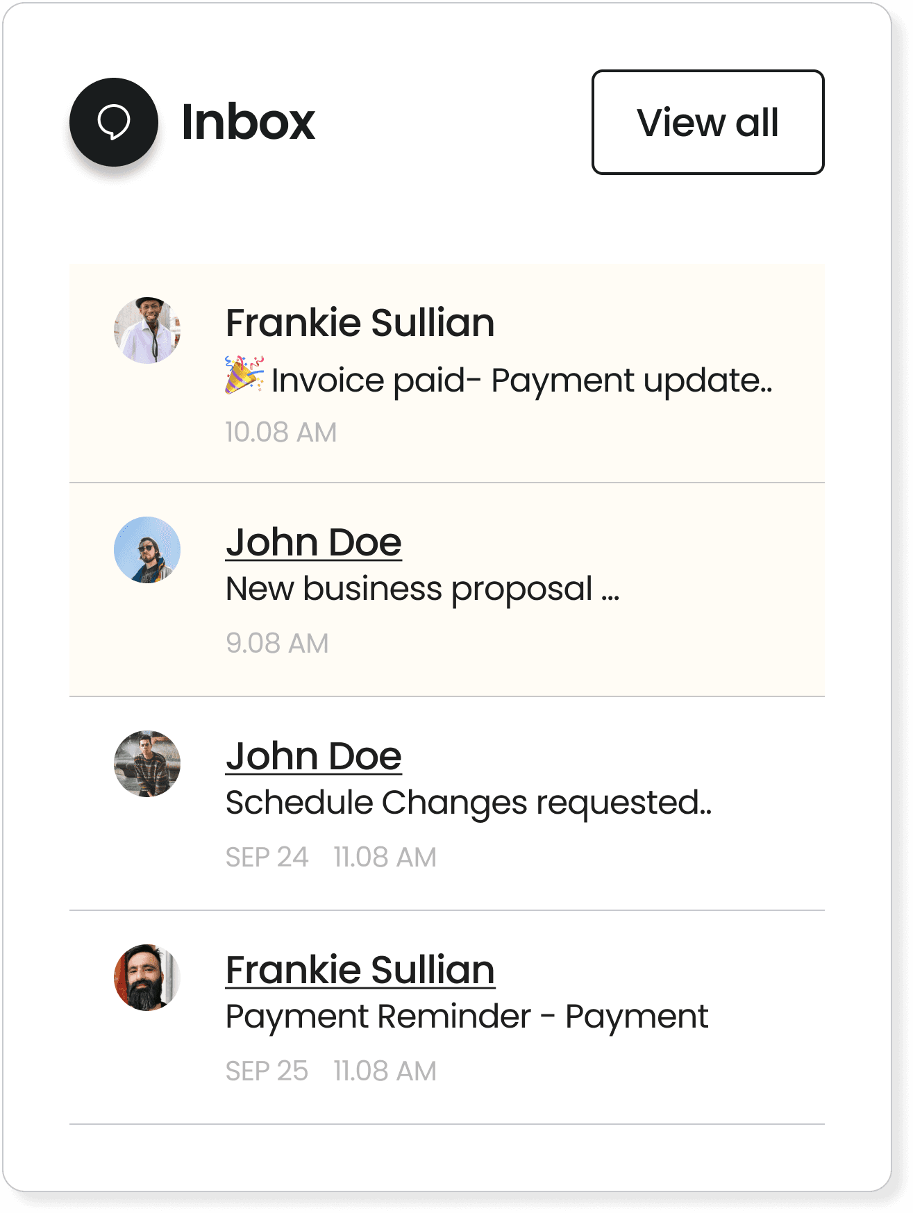
Solution 03—CRM (Client Screen) enables multiple subtasks access
One-Step Actions/Subtask Accessibility
The client screen serves as a centralized hub, combining all CRM-related functions and data within a single "client" tab. Subtasks are nested within the this interface, allowing for seamless navigation without distractions. This structure enables stakeholders to monitor ongoing tasks efficiently and manage multiple subtasks simultaneously.
Solution 04—Unified scheduling UI to declutter interface
Color-Coded Scheduling with Filter
The scheduling screen was redesigned to handle complex data. We introduced color-coded cards for different schedules and added a top filter for easier navigation. By clicking on filtered cards, users can access detailed chart information, preventing data overload on a single screen.
Solution 05—Accelerated Development and Consistent Interface
Reusable Components and Patterns
We built a design system with reusable components and patterns like standardized cards and forms for quick access to main tasks. It sped up development and kept the interface consistent, making the user experience smoother and more intuitive.


Learnings
One major learning from this project was the importance of prioritization. Redesigning a large number of screens with numerous possibilities can easily lead to distractions. By focusing on the core jobs-to-be-done and prioritizing key elements for users and the business, I was able to prioritize meaningful improvements instead of getting caught up in flashy design options that didn’t add real value.

See other case studies
Next